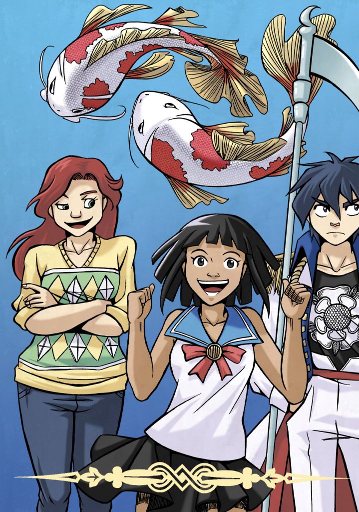
As you may all know, I’ve been working on doing colour art, and as such, has been shaping my artstyle to suit a more simple, streamlined way of colouring.
This has been an interest process – the colour tests for Chapter 1 of “Fabled Kingdom” may have turned out looking lovely, but that kind of colouring just took too long. The colouring style matched the linework, so if I need a simpler style of colouring, I need a simpler style of linework.

So, here are my first attempts – it’s a pretty established style already, since it seemed to have grown fully-formed from my head due to the number of other artistic influences I’ve had over the years. It leaves the “manga” look somewhat, but not by actually as much as it seems. The character on the left looks Disney-influenced, while the character on the right is influenced by lesser-seen but distinctive anime styles like “Kill la Kill” and “Gurren Lagaan“. The one in the middle is a mix of both.
Also, I’m grappling with the RGB vs CMYK issue. I can’t seem to grasp how different RGB vs CMYK is when it comes to how it looks on a screen, and how it looks on print. This is something I need to investigate more, but I have another project apart from the one above which I’m working on, so I’ll be doing that too.
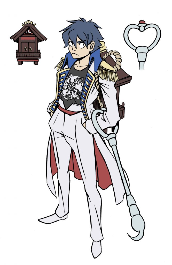
Here’s a colour test attempt for Simon, the character on the right.

