Here are some of the chapter opening art for Fabled Kingdom.
![]()
Story — Characters — Gallery — Read Online
![]()
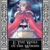 Chapter 1
The second colour illustration for the book I did. I like the bluish tone of it, and the mist.
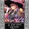 Chapter 2
Bree is actually an important and recurring character in the series. Here, she has a sense of fun by dressing up as a swashbuckler.
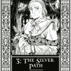 Chapter 3
Poor grandmother Lefrenia doesn't get any colours. Well, she'll be back later on so I'll do it there.
 Chapter 4
Tested my first Cintiq drawing tablet with this picture! Turned out better than expected - my first illustration for this series!
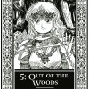 Chapter 5
I do a few b&w illustrations for each book. This turned out detailed, but a little awkward. Better luck next time...
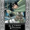 Chapter 6
The colours in this took me ages to get right. Not Quillon, but the leaves in the background. Weird.
 Chapter 7
Not one of my favourites. The queen turned out a little vacant-eyed here, and the background purple happened after fiddling around with the colour balance tool a bit too much.
![]()
 Chapter 8
Interesting choice of background leaves, I may say. However, the red really makes the picture and the colour of the dress pop.
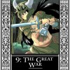 Chapter 9
Pylus does his thing. I like the horned helmet here, but again, "greened" the picture a bit too much with the colour balance tool.
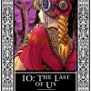 Chapter 10
The queen looks a bit dark here - the whole picture suffers from darkness. But might as well do a dark picture, I suppose...
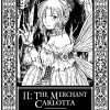 Chapter 11
The evergreen fairy look. Half of the people are repelled, the other intrigued. Should have thought out the pose a little better first.
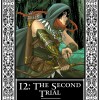 Chapter 12
I rather like this picture. Again, a darker picture, but Quillon's pics will never be bright because he's supposed to be a hunter. Moving in the shadows, etc.
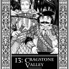 Chapter 13
I like this picture. Great details, and a good contrast between these brother-in-laws. Would be funny if they were twins, but Sir Lansworth there already had a twin.
 Chapter 14
This picture was done in a rush, so I really don't like the colours here. It's just a bit on the brown side, and too harsh. Oh well.
![]()
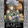 Chapter 15
This is a little strange, due to the feathers, but it was fun too.
 Chapter 16
Another picture with Quillon and bow and arrows. Not one of my favourites, but the silk texture he's wearing is interesting.
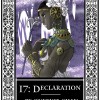 Chapter 17
I like how Dittany's skin is dark here. My first time painting a dark-skinned person, and it looks good!
 Chapter 18
This picture was coloured on a surface tablet, my first try. It's okay, but I should practice colouring more.
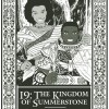 Chapter 19
This was a nice bit of fashion design for Summerstone, for the guys.
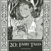 Chapter 20
Quite straight-forward, featuring the White Queen. I wish Gayalette appeared more in this story, but she got her "screen time".
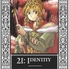 Chapter 21
A nice pink background for the finish. I like the colours in this picture, though it was weird to have green and pink.
